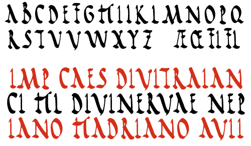


A good Roman Rustic Capitals consists of very regular, well-proportioned, well-spaced letterforms. Clarity and simplicity are the key qualities. Of all the calligraphy alphabets, this is probably the easiest to read, and so is very suitable for longer texts such as passages of prose, books of poetry, diary entries etc.
Your nib should be held at an angle of around 30 degrees; the x-height is 4.5 nib-widths. Ascenders are 7 nib-widths high, ie 2.5 above the x-height, and descenders go 3 nib-widths below the line.
Allow plenty of white space inside and between your letters; don't cramp them. The rounded shapes of 'a', 'b', 'c' etc are quite circular, and strokes are confident and absolutely vertical. Serifs are bold and elegant and letters ending in a downstroke finish with a rounded upflick. Roundhand majuscules are generously proportioned and a full 7 nib-widths high.